Let’s connect and create
something extraordinary.

Let’s connect and create
something extraordinary.

Let’s connect and create
something extraordinary.

Let’s connect and create
something extraordinary.
Ncam
Ncam
Ncam
2020
2020
2020


Role
Role
Senior Art Director
Outcome
Brand Strategy, Creative Direction, Digital Design
Brand Strategy, Creative Direction, Digital Design
Redefining creative freedom
Redefining creative freedom
Ncam, founded in 2012, is a leader in real-time visual effects (RVFX) solutions. They offer advanced camera tracking technology to give creators unmatched control over their visual projects. However, their brand didn’t fully reflect the company's ambitions or the groundbreaking impact of their tech on live broadcasting and film production.
Ncam, founded in 2012, is a leader in real-time visual effects (RVFX) solutions. They offer advanced camera tracking technology to give creators unmatched control over their visual projects. However, their brand didn’t fully reflect the company's ambitions or the groundbreaking impact of their tech on live broadcasting and film production.
Ncam, founded in 2012, is a leader in real-time visual effects (RVFX) solutions. They offer advanced camera tracking technology to give creators unmatched control over their visual projects. However, their brand didn’t fully reflect the company's ambitions or the groundbreaking impact of their tech on live broadcasting and film production.


Idea
Idea
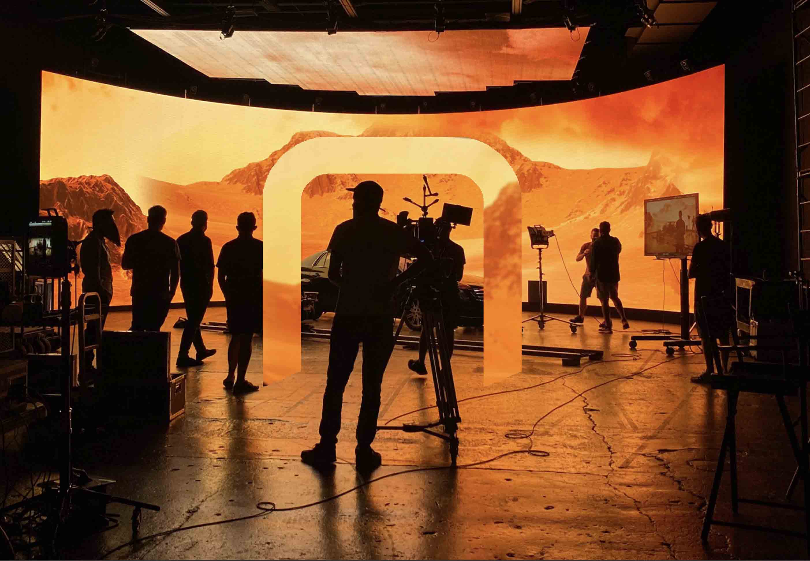
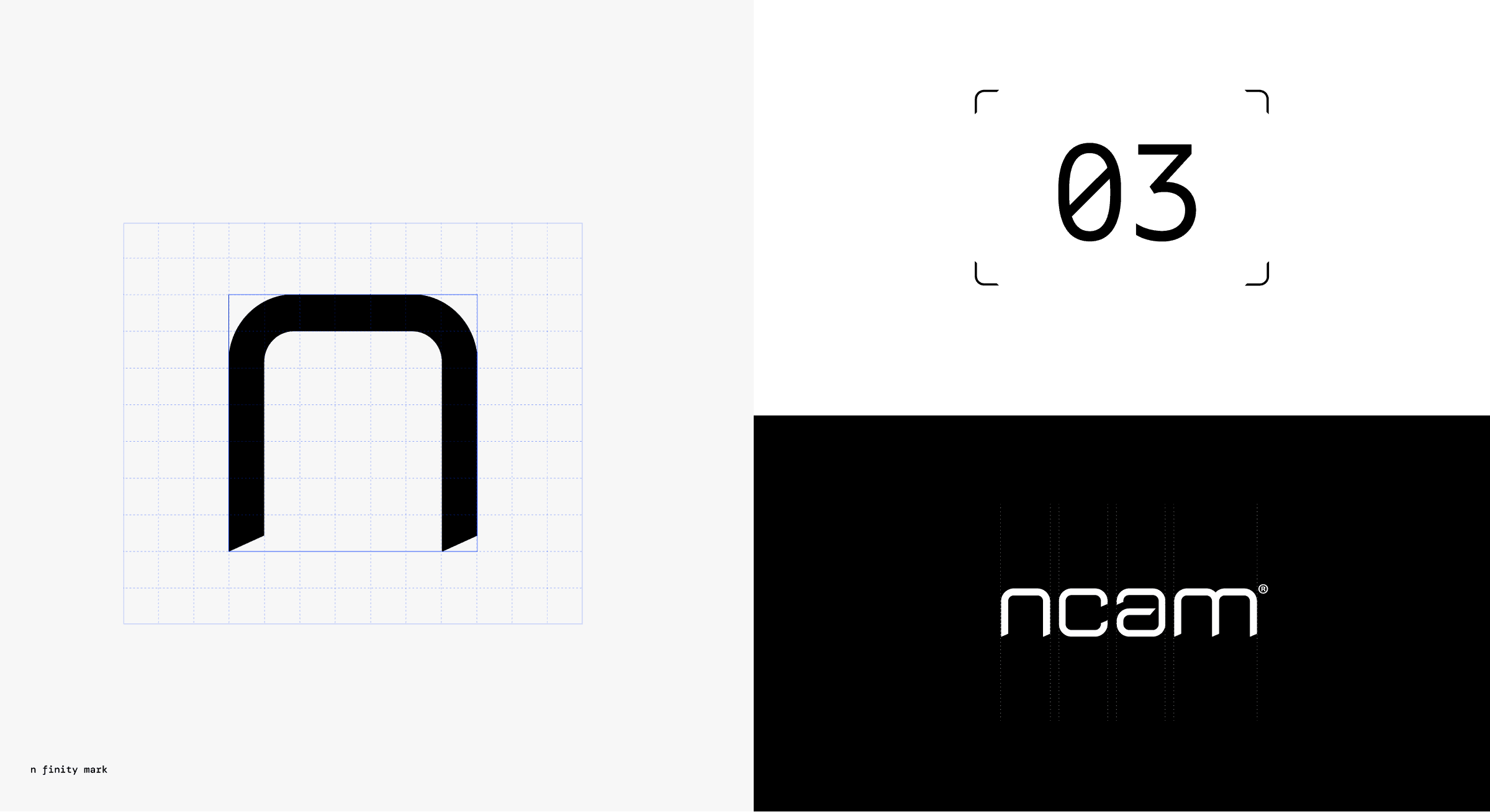
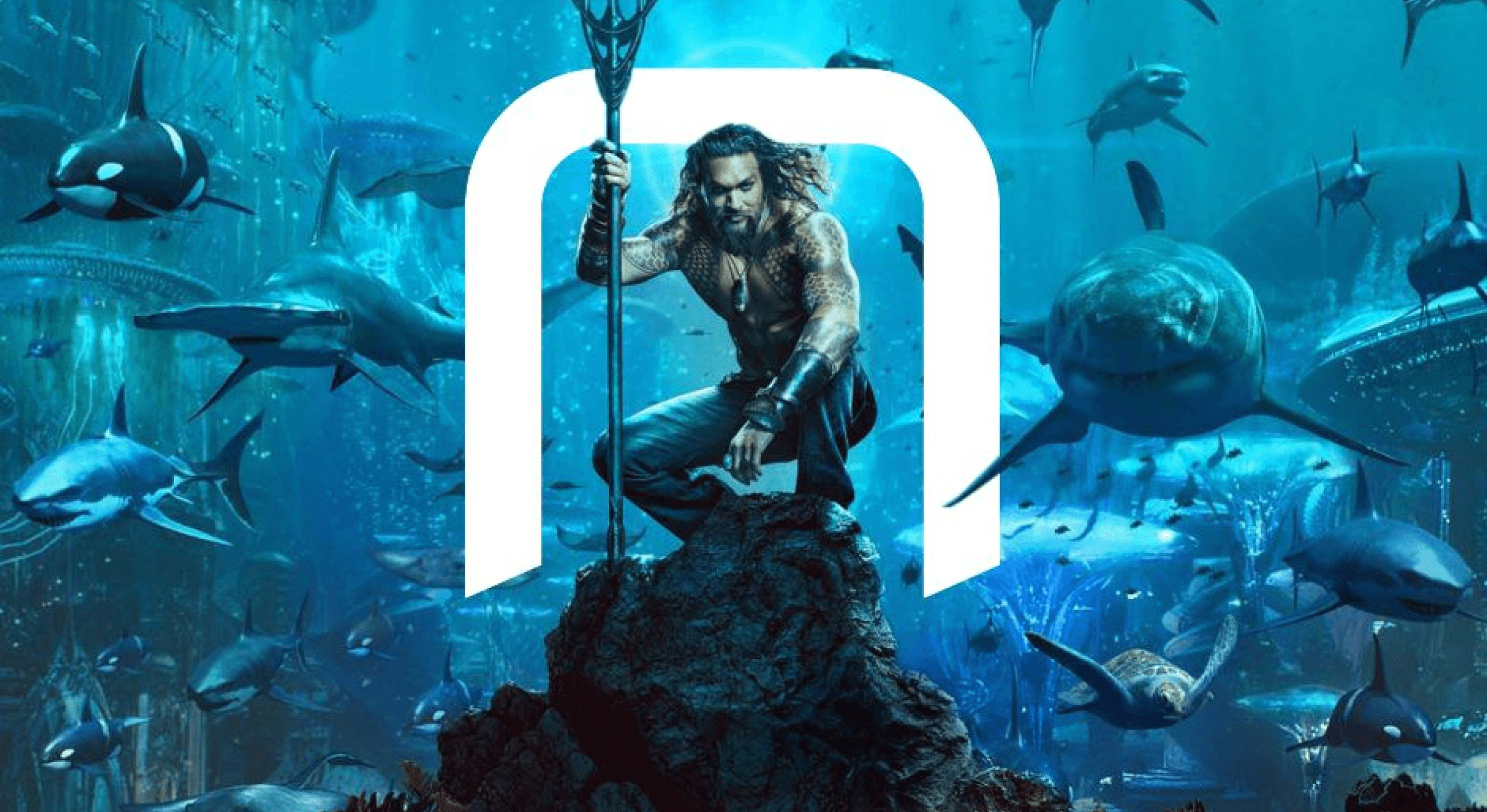
At the core of the rebrand is the concept of “limitless creative possibilities” we expressed this through the ‘Nfinity’ mark, symbolizing the capabilitis of whats possible for camera operators. The logo, inspired by an infinity tunnel, reflects Ncam’s focus on the future of real-time creative vision, while highlighting the lens that drives their technology.
At the core of the rebrand is the concept of “limitless creative possibilities” we expressed this through the ‘Nfinity’ mark, symbolizing the capabilitis of whats possible for camera operators. The logo, inspired by an infinity tunnel, reflects Ncam’s focus on the future of real-time creative vision, while highlighting the lens that drives their technology.
At the core of the rebrand is the concept of “limitless creative possibilities” we expressed this through the ‘Nfinity’ mark, symbolizing the capabilitis of whats possible for camera operators. The logo, inspired by an infinity tunnel, reflects Ncam’s focus on the future of real-time creative vision, while highlighting the lens that drives their technology.


Brand System
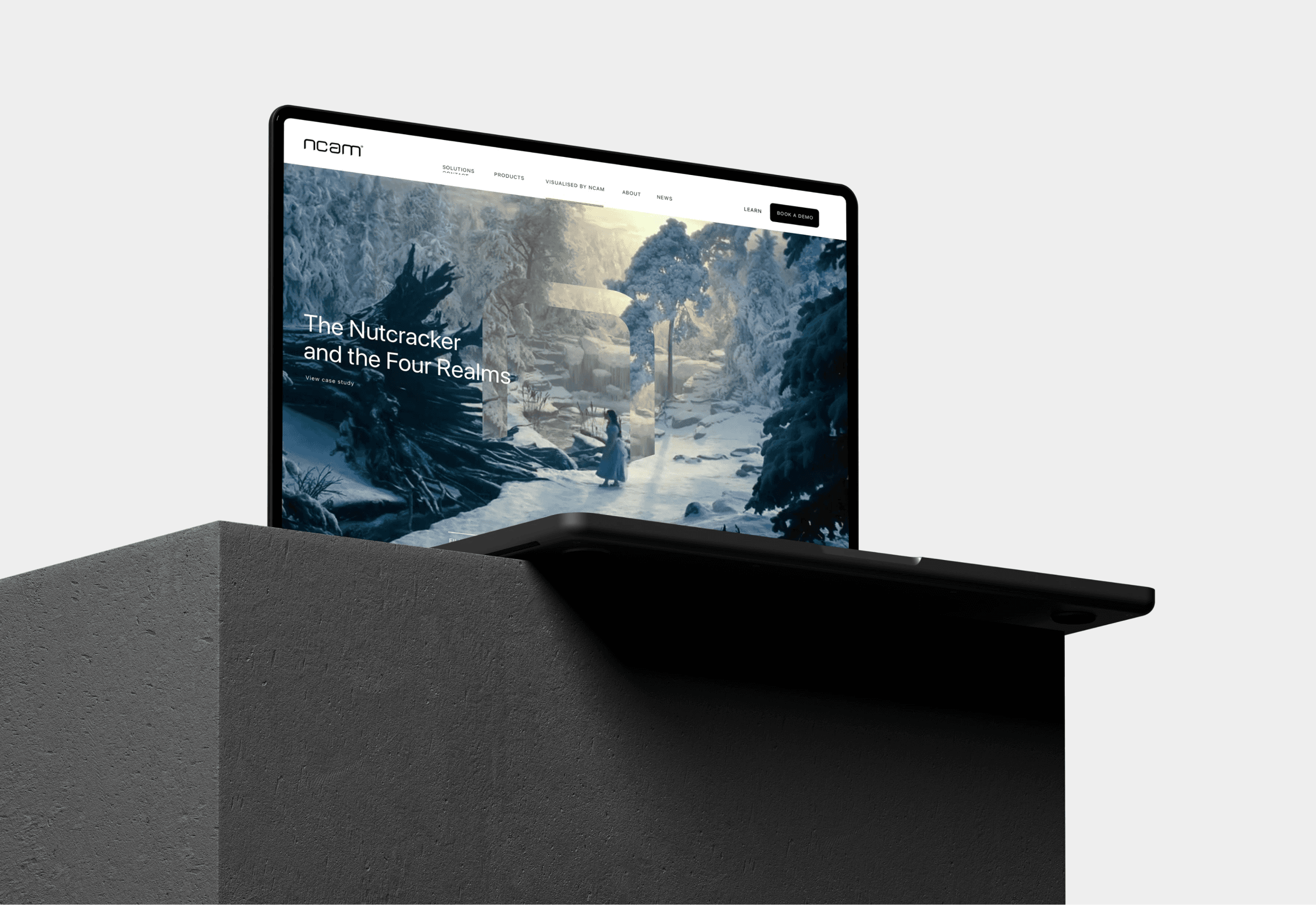
The ‘Nfinity’ logo expands into a flexible design system, where the dynamic ‘N’ plays multiple roles. It forms patterns, graphic elements, and container shapes, creating a cohesive identity. This system extends to Ncam’s font, Ncam SANS, visuals, iconography, art direction, and motion principles for a unified brand experience.


Typography
The Ncam SANS typeface, developed with NaN foundry, is a versatile font inspired by the logo’s shapes. It adapts to various needs, from condensed cuts for long-form content to extended versions for concise messaging, ensuring flexibility across all brand touchpoints.
Typography
The Ncam SANS typeface, developed with NaN foundry, is a versatile font inspired by the logo’s shapes. It adapts to various needs, from condensed cuts for long-form content to extended versions for concise messaging, ensuring flexibility across all brand touchpoints.
Typography
The Ncam SANS typeface, developed with NaN foundry, is a versatile font inspired by the logo’s shapes. It adapts to various needs, from condensed cuts for long-form content to extended versions for concise messaging, ensuring flexibility across all brand touchpoints.
